Framekit templates
Start from a designer-made template
 Use template
 Use template
 Use template
 Use template
 Use template
 Use template
 Use template
 Use template
Nine of the eleven tools in this article are free. Not free-tier-with-an-upsell, free.
So the interesting question is not what a colour palette costs. It is what a bad one costs, and the answer is that the single feature which stops you shipping an unusable palette, a contrast check, is the feature the most popular tool in the category puts behind its paywall.
A colour palette tool is a generator that produces a set of colours as hex, RGB or HSL values, usually with harmony rules, an accessibility check and an export into design or code. Designers use them to start a brand system rather than to finish one.
A palette is not finished when the generator stops. It still has to survive a client review and then hold across a real site, and Framekit is where both of those happen for a lot of designers, which is why it gets a section further down rather than a place in the ranking.
The best colour palette tool in 2026 for most designers is Realtime Colors, because it is genuinely free with no paid tier, it shows the palette applied to a real page rather than as five swatches, and it exports to CSS, Tailwind, SCSS and Figma.
Radix Colors is the better answer for anyone building an interface, because its 12-step scales guarantee contrast rather than checking it afterwards.
Coolors is the fastest generator and the one to buy if you want it, at a reported $3 a month, though its contrast check sits behind that paywall.
The honest caveat is that a palette is the easiest 5% of a brand and no tool here does the other 95%.
- 1Realtime ColorsTop pickThe Only Tool That Shows You the Palette Applied
- 2Radix ColorsAccessibility by Construction Rather Than by Checking
- 3LeonardoGenerate From the Contrast Ratio You Need
- 4CoolorsThe Fastest Generator, With the Wrong Feature Behind the Paywall
- 5Adobe ColorThe Wheel, Plus the Two Checks That Matter
Updated in September 2026: we re-verified Framekit's plans and added how a palette gets presented to a client in a deck, since Framekit now includes Slides; the palette tools themselves are as tested in August 2026.
How We Compared 11 Colour Palette Tools
We ran the same job through every tool: build a five-colour brand palette with a primary, a secondary, a background, a surface and a text colour, then check whether text on background clears the accessibility threshold, then export it in a form a developer can use.
That last step is where most of this category quietly stops being useful.
Pricing and feature claims were read directly from each tool's own pages during this comparison, and the two entries where a page refused an automated request are labelled as reported rather than presented as verified.
Judgments about which tool suits which job are ours, formed by doing the task above rather than by reading feature lists.
One vendor page, Color Hunt, returned a 403 to our requests, so it does not appear in the ranking. Everything ranked below served us readable pages.
In one lineeleven tools, one five-colour brand palette, judged on generation, accessibility checking and whether the export reaches a developer intact.
What Building the Same Palette Eleven Times Showed
The pattern that emerged was not about which generator produces nicer colours. It was about which tools treat a palette as a picture and which treat it as a system.
- 9 of the 11 tools are completely free, with no paid tier at all.
- The only meaningful subscription in the category is a reported $3 a month.
- Coolors gates its contrast check behind Pro, so the free tier will happily hand you a palette that fails.
- 3 tools generate colours from a target contrast ratio instead of checking contrast afterwards, which is a different and better approach.
- 2 of the best tools here are open source and made by people who give them away, one of them Adobe.
- Only 4 tools export in a form a developer can paste without retyping hex codes.
For the tool matched to the job you are doing, jump to the decision guide.
What a Brand Palette Actually Costs
At twelve palettes a year, roughly one per client project for a working freelancer, the money side of this category is almost too small to table. We are tabling it anyway, because the shape of the table is the finding.
| Tool | Price | Cost per palette at 12 a year |
|---|---|---|
| Realtime Colors | Free, stated as 100% free forever | $0.00 |
| Radix Colors | Free, open source | $0.00 |
| Leonardo | Free, Adobe open source | $0.00 |
| Adobe Color | Free | $0.00 |
| Huemint | Free | $0.00 |
| Khroma | Free | $0.00 |
| ColorSpace | Free | $0.00 |
| Colormind | Free | $0.00 |
| Happy Hues | Free | $0.00 |
| Paletton | Free | $0.00 |
| Coolors Pro | Reported $3 a month | About $3.00 |
| Coolors Forever | $99 one time, reduced from $149 | About $2.75 over three years |
The entire category costs a designer somewhere between nothing and $36 a year. If you compared these tools on price you would learn nothing, which is presumably why most comparisons of them read like a list of links.
So the useful conversion is a different one. The cost of a colour palette is not what you pay for it, it is what you pay when it is wrong.
In one lineten of eleven tools cost nothing and the eleventh costs a reported $36 a year, so price is not the axis this decision turns on.
The Cost of a Palette That Fails Contrast
Here is the expense this category actually generates. You choose a palette that looks beautiful as five squares, apply it, and discover that your body text on your background sits below the readable threshold.
The WCAG minimum contrast requirement is 4.5 to 1 for normal text and 3 to 1 for large text, and a great many palettes that photograph well do not clear it.
By the time you find out, the colour is in the logo lockup, the website, the deck template, the social templates, the email signature and whatever you printed. Changing a brand colour after launch is not editing a hex code, it is reissuing every asset that contains it.
That is the real unit of cost in this category, and it is why the ranking below weights accessibility so heavily.
Three tools here generate from a target contrast ratio rather than checking afterwards, which means the palette cannot fail because failure was never in the output space.
Radix Colors, Leonardo and to a lesser extent Realtime Colors work this way.
Coolors, the most used tool in the category by a wide margin, puts "check palette contrast" in its Pro feature list. The free tier, which is what almost everybody uses, generates palettes at speed and does not tell you whether they work.
That is not a scandal, it is a pricing decision, and it is the single most important thing to know about the most popular tool here.
In one linethe feature that prevents an expensive mistake is free in three tools, absent in five, and behind the paywall in the one most people use.
The 11 Best Colour Palette Tools in 2026: Full Comparison
Scores are out of 10 across four weighted criteria: whether the output is accessible by construction or by luck (35%), how usable the export is to a developer (25%), quality and control of generation (25%), and speed to a first usable result (15%).
Accessibility carries the most weight because it is the only thing in this category that costs real money when it goes wrong.
| Tool | Type | Price | Contrast handling | Best for | Score |
|---|---|---|---|---|---|
| Realtime Colors | Live preview generator | Free | Checks, and shows it in context | Seeing a palette as a page | 8.8 |
| Radix Colors | Interface colour system | Free, open source | Guaranteed by construction | Building a product interface | 8.6 |
| Leonardo | Contrast-driven generator | Free, open source | Generates from a target ratio | Accessible colour systems | 8.4 |
| Coolors | Fast generator | Reported $3 a month | Behind the paywall | Speed of iteration | 8.1 |
| Adobe Color | Wheel and harmony rules | Free | Checker plus colour blindness preview | Adobe workflows | 7.9 |
| Huemint | Machine learning generator | Free | Not a focus | Brand palettes with unusual hues | 7.6 |
| Khroma | Personalised AI generator | Free | Rates each pair | Finding your own taste | 7.4 |
| ColorSpace | One colour to a palette | Free | Not a focus | Extending an existing brand colour | 7.0 |
| Colormind | Learns from images and film | Free | Not a focus | Palettes drawn from references | 6.9 |
| Happy Hues | Curated palettes in context | Free | Not a focus | Deciding what a palette feels like | 6.7 |
| Paletton | Classical colour wheel | Free | Not a focus | Learning colour theory properly | 6.4 |
Five entries are marked as not focused on contrast and that is a description rather than a criticism. Several of them are inspiration tools, and an inspiration tool that pretended to certify accessibility would be worse than one that does not try.
1. Realtime Colors: The Only Tool That Shows You the Palette Applied
PriceFree. The site lists Basic, Pro and Enterprise tiers and every one of them is priced at $0.00 a month, with the page stating the tool is 100% free, forever.
Best forAnyone choosing brand colours who needs to see them as a page rather than as five squares.
Rating8.8 out of 10
Every other generator in this article hands you swatches. Realtime Colors applies your colours to a full sample website in front of you, so you are looking at headings, body copy, buttons and backgrounds in their real proportions while you adjust.
That sounds cosmetic and it is not. A palette lives or dies on proportion. Five colours in equal squares tell you nothing about what happens when one of them is 70% of the screen and another is 4%, and almost every palette that looks striking as swatches is exhausting as a page.
The detail that pushed this to first place is the export list, which is unusually complete for a free tool: CSS, Tailwind, SCSS, custom code, shades and gradients, and a ZIP download, with values in HEX, RGB, HSL, OKLAB or OKLCH and presets for DaisyUI, shadcn, NextUI, Flutter, Bootstrap and Material UI.
There is a Figma plugin with a reported 19,000-plus users.
That is the difference between a palette you look at and a palette a developer implements without retyping anything.
The gotcha is that the sample page is one sample page. It is a good one, but it biases you toward palettes that suit that specific layout, and a palette that reads beautifully there can still fail on a photography-heavy site where images carry most of the colour.
The other honest limit is that this is a chooser rather than a generator. It will not invent an interesting palette for you the way Huemint or Khroma will. You bring the colours and it tells you the truth about them.
Skip it ifyou want the tool to originate the palette rather than validate it, because that is not what this is for.
Verdict: the best free colour tool in this category and the one we would open first. Generate somewhere else if you need inspiration, then bring the result here before you commit to anything, because seeing colour in real proportion changes decisions.
2. Radix Colors: Accessibility by Construction Rather Than by Checking
PriceFree and open source, published on GitHub.
Best forDesigners and developers building a product interface who want the contrast question closed before it opens.
Rating8.6 out of 10
Radix Colors is not a palette generator and including it here is deliberate. It is a colour system: 40 or more named scales, each with 12 steps, where every step has a defined job. Steps for backgrounds, steps for borders, steps for text, steps for overlays.
The claim that matters is on the page itself, that text colours are guaranteed to pass target contrast ratios against the corresponding background colours, calculated with the APCA algorithm. Not checked. Guaranteed, because the scale was built to that constraint.
For anyone who has ever shipped a palette and then spent a week nudging greys, that is a different category of product.
Dark mode is the detail that sells it in practice. The page describes switching themes as applying a class to a container, because each scale has a dark counterpart where step 3 does the same job in both. Most palettes handle dark mode by inverting and hoping. This does not.
There is also alpha-transparent variants and P3 gamut support, which matter more than they sound when your interface has overlays and your users have modern displays.
The honest limit is scope, and it is a real one. This is an interface colour system, not a brand palette generator. It will not give you a distinctive brand colour, and a photographer or illustrator looking for a signature hue will find nothing here.
Skip it ifyou are branding rather than building, because Radix answers a question you are not asking.
Verdict: the correct answer for product interfaces and the wrong answer for brand identity. If your palette will end up as CSS custom properties in an application, start here and skip most of this article.
3. Leonardo: Generate From the Contrast Ratio You Need
PriceFree and open source. The site describes Leonardo as an Adobe Open Source project, available on GitHub.
Best forDesigners building an accessible colour system or a data visualisation palette.
Rating8.4 out of 10
Leonardo inverts the usual workflow and once you have used it the usual workflow feels backwards.
Instead of picking colours and then measuring their contrast, you state the contrast ratios you need and Leonardo generates swatches that hit them.
The site puts it plainly: colour swatches are generated by target contrast ratios so you no longer need to manually check contrast.
For a designer building a system with defined roles, primary text, secondary text, disabled states, borders, that is exactly the right shape. You are specifying requirements and receiving colours, rather than proposing colours and negotiating with a checker.
The data visualisation support is the part that surprised us and it is genuinely rare.
Leonardo offers control over perceptually uniform sequential and diverging scales, plus colourblind-safe generation that cycles through colours and evaluates measurable colour difference for each type of colour vision deficiency.
Nothing else free in this comparison does the last part.
That Adobe funds and open sources this while charging for Creative Cloud is worth noting as a point in Adobe's favour, which is not a sentence we write often.
The gotcha is the interface. Leonardo is a tool built by people who think in colour science, and it shows. There are more controls than a designer looking for a quick brand palette wants to meet, and the learning curve is real.
Skip it ifyou want five nice colours in thirty seconds, because Leonardo will ask you questions first.
Verdict: the most technically serious free tool in this category and the right one for systems work and data visualisation. Steep enough that most people should pair it with something faster for the early exploration.
4. Coolors: The Fastest Generator, With the Wrong Feature Behind the Paywall
PriceFree tier with ads, palettes up to 5 colours, 10 saved palettes, 1 project and 1 collection, 5 saved colours.
Pro is a reported $3 a month and adds unlimited saves, palettes up to 10 colours, contrast checking, palette variations, advanced exports, dark mode and 3,000 AI credits a month.
A Forever plan is listed at $99 as a one-time payment, reduced from $149.
Best forGenerating and discarding palettes at speed, which is most of what early exploration is.
Rating8.1 out of 10
Coolors earned its position in this category honestly. Pressing the space bar to regenerate is the fastest exploration loop anyone has built for colour, the palette library is enormous, and the picking-from-image tool works better than most paid equivalents.
If your process is to look at 200 palettes before you find the one, nothing here competes.
Then there is the thing we cannot get past. Check palette contrast is listed as a Pro feature.
The free tier, which is the tier the overwhelming majority of the category's users are on, will generate palettes all day and never mention that the one you saved has body text at a ratio no one can read.
Contrast checking is not an advanced feature. It is the difference between a palette and a decoration, and putting it behind a reported $3 a month means the most-used colour tool in the world ships accessible-by-accident output as its default.
The Forever plan at $99, down from $149, is a genuinely fair offer if you use Coolors weekly. Over three years at twelve palettes a year that is about $2.75 a palette, and unlike almost everything else in a designer's stack it does not renew.
The free tier limits are tighter than they first appear too. Ten saved palettes and one project sounds generous until you realise a single brand project uses several palettes across light and dark.
Skip it ifyou will not pay and you need the output to be accessible, because the free tier cannot tell you whether it is.
Verdict: the best generator here and the one we would most like to change. Buy Forever at $99 if Coolors is where you actually work, and if you stay on the free tier, run every palette you like through Realtime Colors or Leonardo before you commit to it.
5. Adobe Color: The Wheel, Plus the Two Checks That Matter
PriceFree to use in a browser. Adobe's page invites you to get started for free and does not state whether saving to a library requires an Adobe account or a Creative Cloud subscription, so treat integration with Creative Cloud as the part to verify for your own setup.
Best forDesigners already working in Adobe applications who want palettes that land in their libraries.
Rating7.9 out of 10
Adobe Color is the colour wheel most designers learned on and it remains a competent implementation of classical harmony rules: analogous, monochromatic, triad, complementary, split complementary, and custom.
What lifts it above the other wheel-based tools here is the accessibility section.
The page describes a contrast checker that measures the ratio between foreground and background to help ensure text is readable, and a colour blindness preview that shows how the palette appears across different types of colour vision deficiency.
That second one is the rare feature. Leonardo does it more rigorously, but Adobe Color puts it one click from a colour wheel that a designer with no colour science background will happily use, and reach matters.
The extract-from-image and extract-from-video tools are better than they need to be, and for anyone building a palette from a photograph or a film reference they are the fastest route in this comparison.
The gotcha is the ecosystem gravity. Adobe Color is most valuable when your palette syncs into Creative Cloud Libraries and appears in Photoshop and Illustrator, and that value evaporates entirely if you work in Figma and Affinity.
Skip it ifyou are not in Adobe applications, because the standalone tool is good and the integration is the point.
Verdict: free, competent and the best on-ramp to accessibility for designers who would not otherwise check. If Creative Cloud is your workspace this is the default and there is no argument to make against it.
6. Huemint: Machine Learning That Produces Colours You Would Not
PriceFree. The site describes the tool without stating any pricing.
Best forBrand palettes that need to look unlike the palettes everyone else generated this month.
Rating7.6 out of 10
Huemint uses machine learning to generate schemes, and the useful part is that it asks what the palette is for before it generates.
Brand identity, website or graphic each produce meaningfully different output, because the model has been trained on how colour distributes differently across those media.
The results skew unusual in a way that is genuinely valuable. Fast generators converge on the same fashionable ranges because that is what their users save. Huemint produces combinations that feel deliberate rather than trending, which for brand work is the whole job.
A small detail we enjoyed finding: Colormind's site links to Huemint as a project by the same maker, alongside a colour wheel, a logo maker and a font pairing tool.
Two of the eleven entries in this comparison come from one person, which says something about how much of this category is built by individuals rather than companies.
The gotcha is that accessibility is not a focus. Huemint gives you interesting colour and leaves the contrast question entirely to you, which is fine as long as you know it and take the result somewhere that checks.
Skip it ifyou need the output to be accessible without a second step, because there is no checker here.
Verdict: the best free source of genuinely distinctive brand colour in this comparison. Generate here, then validate in Realtime Colors or Leonardo before anything reaches a client.
7. Khroma: The Generator That Learns What You Like
PriceFree. The site states no pricing.
Best forDesigners who want a personalised generator rather than a random one.
Rating7.4 out of 10
Khroma opens by asking you to pick 50 colours you like, then trains on that selection and generates endlessly from your own taste. The site describes it as using AI to learn which colours you like and creating limitless palettes to discover, search and save.
The onboarding is a real commitment, five minutes of clicking swatches before you see anything, and it is the reason the tool works. Every generator that skips this step is generating from everybody's taste, which is a good description of why so much design looks the same.
The accessibility handling deserves credit. The page states you get colour names, hex codes, RGB values, CSS code and a WCAG accessibility rating for each pair, which puts a free tool ahead of Coolors' free tier on the one feature that matters most.
The limit is that Khroma generates pairs and combinations rather than complete brand systems. You will get striking two and three colour relationships and then have to build the neutrals and surfaces yourself.
Skip it ifyou want a full five-role brand palette in one output, because that is not the shape of what it produces.
Verdict: the most personal tool in this comparison and worth the five-minute setup if colour choice is a recurring part of your work. Free, with a WCAG rating on every pair, which is more than the market leader offers without payment.
8. ColorSpace: One Colour In, A Usable Palette Out
PriceFree.
Best forExtending a brand colour you already have into a working palette.
Rating7.0 out of 10
ColorSpace solves a specific and common problem. You have one colour, usually because a logo already exists, and you need the other four. Enter the hex code and it returns a range of palettes built around it, plus gradients, including three-colour gradients.
That is a narrower job than most of this list attempts and it does it faster than any of them. For a designer picking up an existing brand rather than creating one, this is often the only tool needed.
The presentation is plain and the site is honest about what it is, promising that you never waste hours finding the perfect palette again by entering a single colour. There is no account, no upsell and no feature ladder.
The gotcha is that there is no contrast checking and no real control over the generation. You take what it gives you or you enter a different starting colour.
Skip it ifyou are starting from nothing, because ColorSpace needs a colour to work from.
Verdict: a small free tool that does one job well. Keep it bookmarked for the day a client sends you a logo and asks for a website, which is a day that comes around often.
9. Colormind: Palettes Learned From Photographs and Film
PriceFree, with a public API.
Best forPalettes that carry the mood of a photographic or cinematic reference.
Rating6.9 out of 10
Colormind is a scheme generator using deep learning, and the interesting part is the training data.
The site states it learns colour styles from photographs, movies and popular art, and that different datasets are loaded each day, so the output genuinely changes over time rather than cycling the same distribution.
For anyone whose work has a reference image, a film still, a location, a fabric, the image upload path produces palettes that feel derived from the source rather than sampled from it, which is a different and usually better result than a naive eyedropper.
The API is the detail worth knowing for developers. A free public API for palette generation is unusual, and it turns Colormind into infrastructure rather than a website.
The interface is dated and the tool makes no accessibility claims at all. It gives you five colours and a website preview and considers the job done.
Skip it ifyou need contrast guarantees or a modern interface, because neither is on offer.
Verdict: free, genuinely different in how it generates, and best used as a source of direction rather than a finished palette. The API is the underrated part.
10. Happy Hues: Curated Palettes You Can Actually Read in Context
PriceFree.
Best forDeciding what a palette feels like before you commit to generating one.
Rating6.7 out of 10
Happy Hues describes itself as curated colours in context, and the whole site is the demonstration: you click through palettes and the example website you are reading recolours itself, with each colour labelled by the role it is playing.
The labelling is the part that teaches. Seeing a specific hex marked as the button background and another as the paragraph text, applied to a page you are actively reading, does more to explain palette structure than any amount of colour theory.
It is curated rather than generative, which means the selection is finite. You are choosing from a designer's picks, not producing new ones, and the set is small enough to exhaust in an afternoon.
For a beginner or for anyone stuck at the start of a project, it is the fastest route to understanding what you are actually looking for.
Skip it ifyou need a specific colour or a large search space, because there are only so many palettes here.
Verdict: a teaching tool disguised as a palette site, and free. Use it to work out what you want, then go somewhere generative to make it.
11. Paletton: Classical Colour Theory, Done Properly Since 2002
PriceFree.
Best forDesigners who want to understand why a combination works rather than just that it does.
Rating6.4 out of 10
Paletton has been running since 2002 and its own page says so with some affection, describing itself as in love with colours since that year.
It builds palettes of one to four hues, each in five shades, using classical colour theory on the RYB artistic colour wheel rather than the RGB wheel most software uses.
That distinction is not trivia. The RYB wheel is the one taught in art education, where the complement of blue is orange, and it produces different and often more traditionally harmonious results than the RGB relationships a modern tool defaults to.
The preview modes are the part that has aged well. You can view a palette in several presentation styles to test combinations, which was ahead of its time and is still more useful than a row of swatches.
The interface is from another era and makes no concession to that fact, and there is no accessibility checking anywhere in it.
Skip it ifyou want a modern workflow, because nothing here has been modernised and that is partly the point.
Verdict: a colour theory education that happens to be a working tool, free, and the best place in this comparison to learn why palettes work. Not where you should build a production palette in 2026.
Which Tools Get Your Palette to a Developer Intact
The step this category most often fails is the last one. A palette that exists as five hex codes on a website is not a deliverable, it is a note, and somebody has to retype it.
| Tool | Export formats | Code-ready | Design tool integration |
|---|---|---|---|
| Realtime Colors | CSS, Tailwind, SCSS, custom code, ZIP, HEX/RGB/HSL/OKLAB/OKLCH | Yes | Figma plugin, reported 19,000-plus users |
| Radix Colors | Installable package with named scales | Yes | Built for code first |
| Leonardo | Generated scales with contrast targets | Yes | Open source, scriptable |
| Colormind | Public API | Yes | API only |
| Coolors | Advanced exports on Pro | Partly | Behind a reported $3 a month |
| Adobe Color | Creative Cloud Libraries | Partly | Adobe applications only |
| Khroma | Hex, RGB and CSS code per pair | Partly | Copy and paste |
| Huemint, ColorSpace, Happy Hues, Paletton | Hex values on screen | No | Retype it |
Four tools produce something a developer can consume without transcription, and three of those four are free and open source.
That is the clearest quality signal in this comparison: the tools built by people solving their own problem export properly, and the tools built to attract traffic mostly do not.
Realtime Colors' preset list is worth restating because it is unusual: DaisyUI, shadcn, NextUI, Flutter, Bootstrap and Material UI, alongside OKLCH values that modern CSS actually wants.
A free tool shipping OKLCH exports while paid tools ship hex codes says something about who is paying attention.
In one line4 of 11 tools export in a form a developer can paste, and 3 of those 4 are free and open source.
Where the Palette Has to Live
This is our own product category, so treat this section as an interested party arguing its corner and read the limits at the end as the honest part, because a palette is not finished when it is exported; it is finished when a client has approved it and it holds together across a site.
A palette is one component of an identity, and our comparison of AI logo makers covers the other one most people generate before they hire anybody.
The usual failure is drift: the button blue shifts, a third grey appears from nowhere, and within six months five colours have become fourteen.
Framekit is an AI website builder, and it covers both halves.
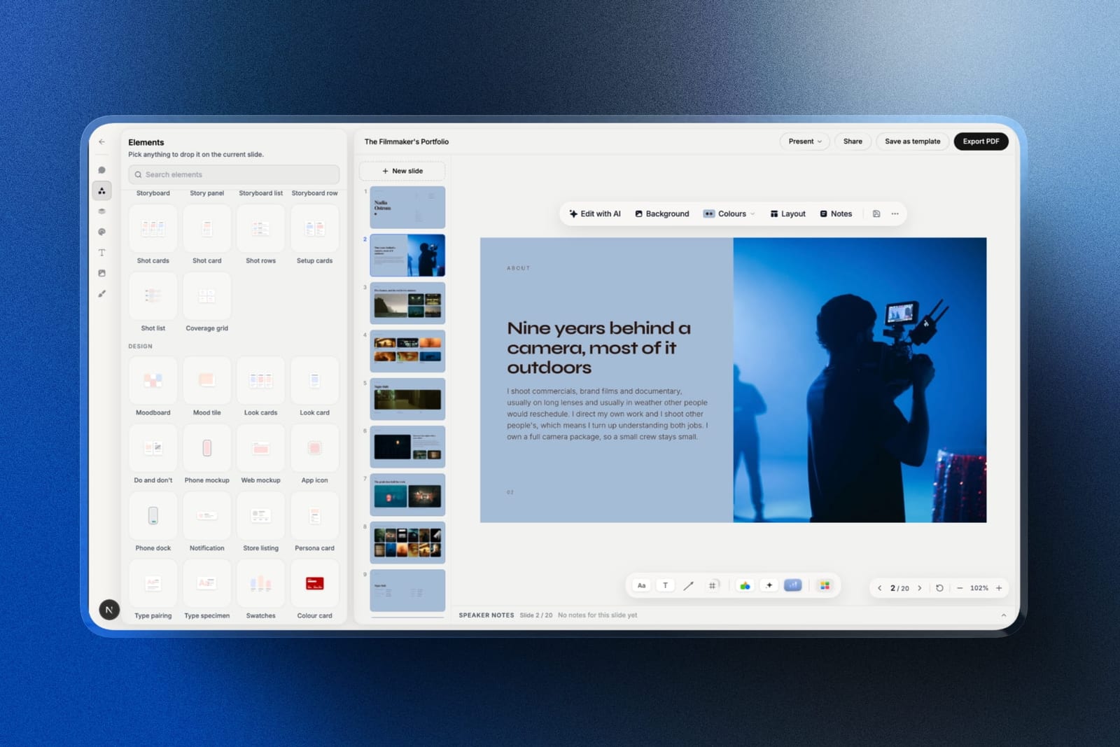
Its Slides tool has colour swatch elements and applies your own colours across every slide, so the palette can be presented to a client as a deck with swatches, contrast pairings and mockups, exported to PDF on every plan.
On the site, colour is a system property rather than a per-element choice, so changing the brand colour once changes it everywhere.
Where this argument loses, plainly. If you need a design token pipeline feeding an application and a marketing site from one source, that is what Radix Colors and Leonardo exist for, and Framekit exports no tokens.
If your brand system has to govern print, packaging and signage, no website tool addresses that.
The Decision Guide
Work down this list until a branch matches what you are actually trying to do, because every tool here is free or nearly free and the only real cost of picking wrong is the rework when a palette turns out to be unusable.
You have candidate colours and need to know if they work. Realtime Colors. Seeing them applied in real proportion answers the question faster than any checker.
You are building a product interface. Radix Colors. The scales guarantee contrast rather than checking it, and dark mode comes free.
You need an accessible system with defined roles, or a data visualisation palette. Leonardo. Generate from the contrast ratios you need and stop measuring afterwards.
You want to explore fast and see hundreds of options. Coolors. Take the free tier for exploration and validate elsewhere, or buy Forever at $99 if this is where you work.
You live in Photoshop and Illustrator. Adobe Color. The Creative Cloud Libraries sync is the reason, and the colour blindness preview is a bonus most designers never use elsewhere.
You want brand colour that does not look like this year's brand colour. Huemint, then validate the contrast somewhere else.
You want a generator tuned to your own taste. Khroma. Spend the five minutes on the onboarding, it is the entire product.
You already have one brand colour and need the rest. ColorSpace. Enter the hex, take the palette.
You are working from a photograph or a film reference. Colormind, or its image upload path specifically.
You do not yet know what you want. Happy Hues. Click through until something feels right, then go and generate it properly.
You want to understand colour rather than pick it. Paletton, on the RYB wheel, which is the one art education actually teaches.
Frequently Asked Questions
Are colour palette tools free?
Almost entirely, yes.
Nine of the eleven tools in this comparison have no paid tier at all, which is unusual even among the free-leaning categories in our roundup of AI tools for designers, and the one meaningful subscription is a reported $3 a month for Coolors Pro, with a $99 one-time Forever plan reduced from $149.
Price is not a useful way to choose in this category.
Which colour palette tool checks accessibility for free?
Realtime Colors, Leonardo, Adobe Color and Khroma all handle contrast without payment, and Radix Colors guarantees it by construction. Coolors places its contrast check behind Pro, which matters because Coolors is the tool most people use.
What contrast ratio does a brand palette need to hit?
The WCAG minimum is 4.5 to 1 for normal text against its background and 3 to 1 for large text. A palette that misses this does not fail visibly at first, it fails for a portion of your audience quietly, and fixing it after launch means reissuing every asset the colour appears in.
Can I use a generated colour palette commercially?
Colours themselves are not copyrightable, so a generated palette carries no licence burden in the way a licensed font or a stock photo does.
What can be protected is a specific colour used as a trade mark in a specific industry, which is a narrow and well-known set of cases rather than something a palette generator will put you near.
What is the difference between a palette and a colour system?
A palette is five or so colours. A colour system defines the role each colour plays, generates the steps between them, handles dark mode, and holds contrast guarantees across every pairing. Radix Colors and Leonardo produce systems.
Most of the rest of this list produces palettes, which is the easier and smaller half of the job.
Should I use hex, HSL or OKLCH for my brand colours?
Hex for handoff to anyone non-technical, because it is universal. OKLCH for implementation in modern CSS, because it is perceptually uniform, which means adjusting lightness does not shift the apparent hue.
Realtime Colors exports all of them, which is one of the reasons it ranks first here.
Do I need a paid tool to build a professional brand palette?
No. The three highest-scoring tools in this comparison are free, two of them are open source, and one of those is funded by Adobe. Paying for Coolors buys speed of exploration and a contrast check, both of which are available free elsewhere.
How many colours should a brand palette have?
Five is the working answer for most independent creative businesses: a primary, a secondary, a background, a surface and a text colour.
Coolors' free tier caps at five for that reason, and its Pro tier extends to ten, which is more than most brands can hold consistent without a token system enforcing it.
Once the palette is settled it has to be documented somewhere a client's team will actually read it, and our comparison of eight brand guidelines tools found the pricing models differ far more than the products do.
Type carries the other half of a brand system and it is priced very differently from colour, since a font family is up to five separate licences rather than a free download, which we cost out across twelve font marketplaces.
How should I present a colour palette to a client?
Show it applied, not as five swatches in a row: a slide per role with hex values, a contrast pairing for text, and two mockups of the palette in use.
Framekit Slides has swatch and mockup elements for this and exports PDF free, and Figma works if the client already reviews files there.
The Verdict
Realtime Colors is the best colour palette tool in 2026, it is free with no paid tier at all, and it wins on the least glamorous criterion available: it shows you the truth about a palette before you commit to it, and it exports in a form a developer can use without retyping anything.
Radix Colors and Leonardo are the better answers for systems work, and both are free and open source. If your colours will end up as tokens in an application, start with those and skip the generators entirely.
Coolors remains the fastest way to explore and the $99 one-time Forever plan is a fair deal for anyone who works there weekly, but the contrast check belongs in the free tier and it is not there.
The finding that ran through every table in this article is that money is not the variable. Ten of eleven tools cost nothing, so the real question is whether the tool tells you when your palette does not work, and five of them never will.
Pick a generator you like for the exploration, and then run whatever you fall in love with through something that checks, because the only expensive colour palette is the one you launch and then have to change.