Framekit templates
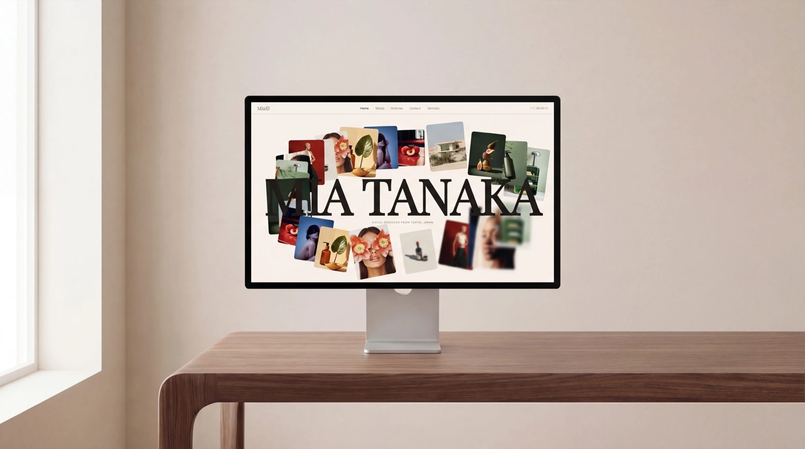
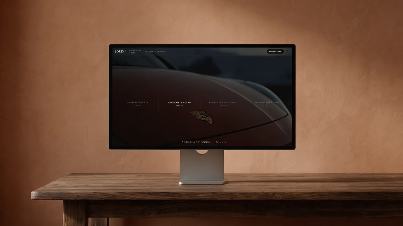
Start from a designer-made template
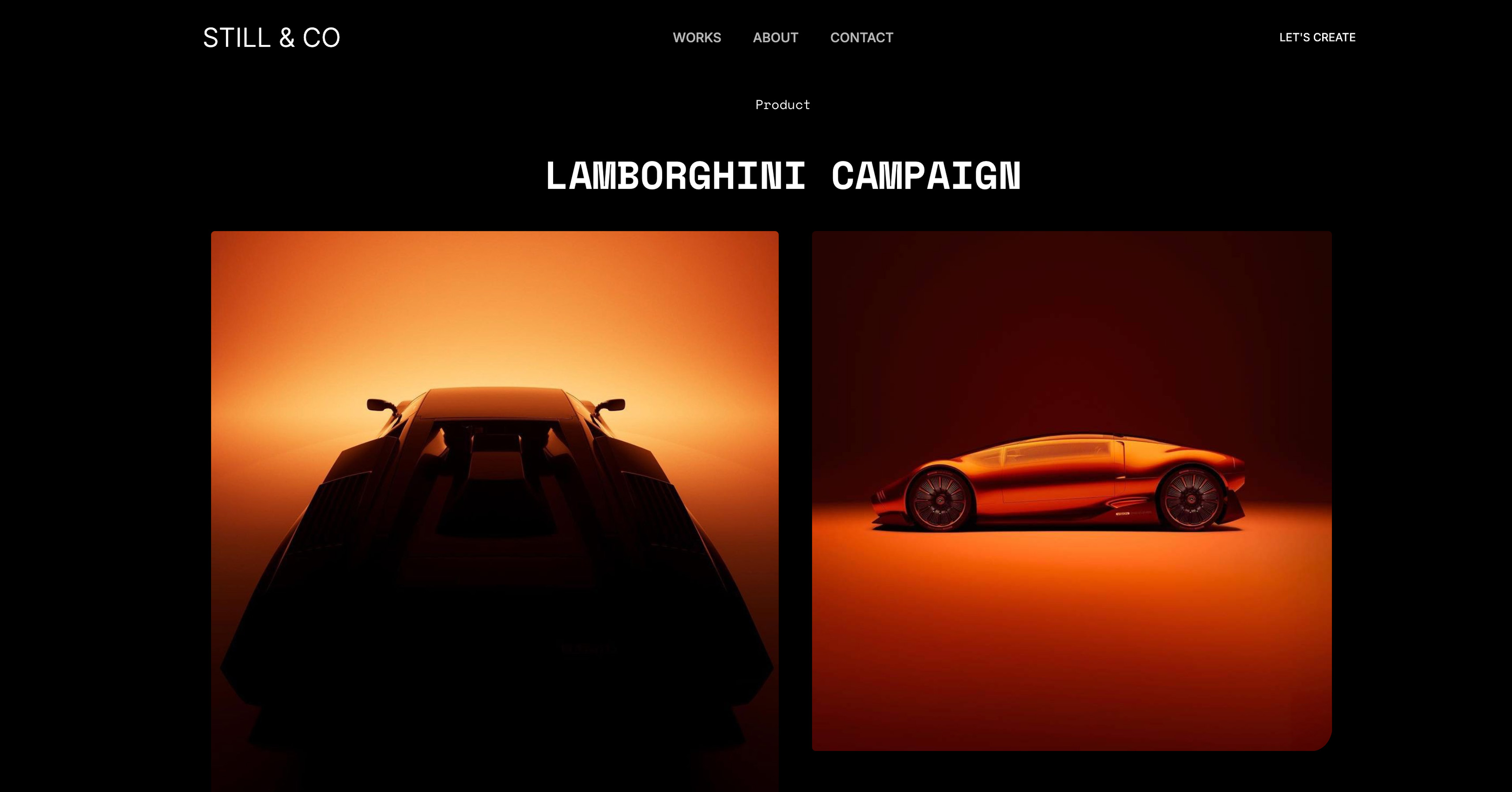 Use template
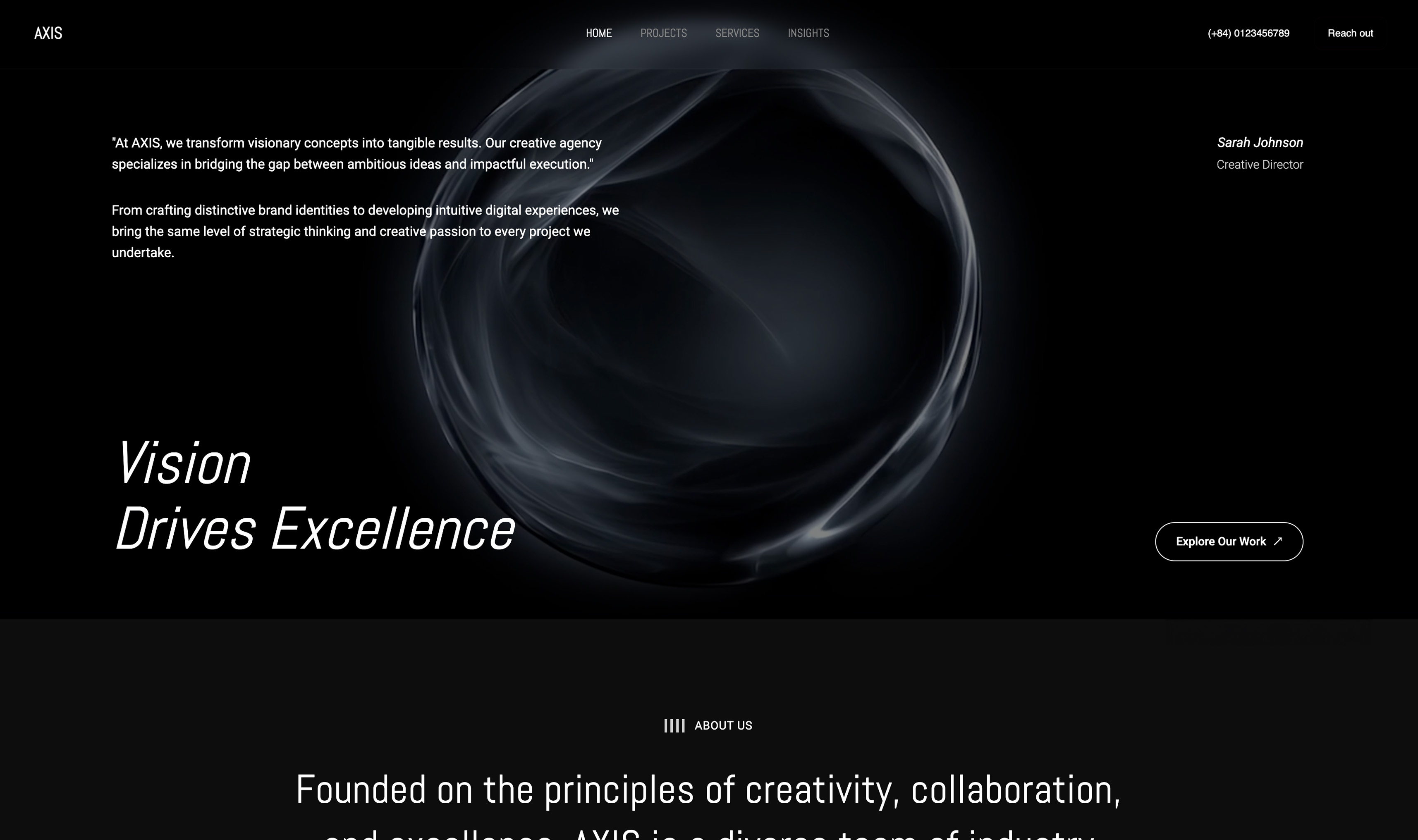 Use template
 Use template
 Use template
 Use template
 Use template
 Use template
 Use template
Most people make a mood board by collecting forty images they like and arranging them attractively. Then the client points at image thirty-one, which you included as texture, and says "that one, exactly that", and now you are making something you never proposed.
That failure is not a taste problem. It happens because the board was a collage rather than a decision, and a collage invites the reader to pick, while a decision asks them to agree.
A mood board is a curated set of images, colours, type, and textures assembled to settle a specific question about how something should look and feel, before any of the expensive work begins.
Framekit is worth naming here because its Slides editor ships moodboard and look-card elements, so the board can be built, annotated, and then handed over as a link or a PDF without being assembled in one tool and laid out again in another.
To make a mood board that works, start by writing down the one decision it has to settle, gather widely and then cut to no more than fifteen images, group them by the property you are arguing for rather than by how they look, annotate each group with one sentence explaining what you are pointing at, and include two or three deliberate anti-references so the reader can see the boundary of what you are proposing.
Present it in person or with narration if you possibly can, and publish it as a page rather than sending a PDF so the version everyone holds stays current.
Framekit is an AI website builder for creatives, so a finished mood board can be published as a page on your own domain rather than emailed as a file.
What a Mood Board Is Actually For
A mood board exists to make disagreement happen early, when it costs an afternoon, rather than late, when it costs a reshoot. That is its whole job, and almost every rule below follows from it.
It is not a portfolio, so it should not only contain work you admire. It is not a shopping list, so the client should not be choosing from it.
And it is not a decoration for the proposal, though it is very often used as one, which is why so many are agreed enthusiastically and then produce a surprised client at the review.
The test of a good mood board is whether someone could look at it and correctly reject your proposal. If nobody could disagree with it, it did not say anything.
In one linea mood board is a decision document whose success is measured by the arguments it starts before the work begins rather than by how attractive it looks in the deck.
Step 1: Write Down the Decision It Has to Settle
Before collecting a single image, write one sentence describing what this board must resolve. Not "the vibe for the campaign" but something a person could answer yes or no to.
Good examples from real projects: "Is this brand warm and handmade, or precise and industrial?" "Should the film's night exteriors be sodium orange or moonlight blue?" "Does the packaging read as premium through material or through restraint?"
That sentence does two things. It tells you which images belong, which removes about half of what you would otherwise gather. And it gives you the opening line of the presentation, which is the line most mood board presentations lack.
Write it at the top of the board. Not in the email, on the board, because the board will be forwarded to people who never saw the email.
In one linea mood board without a stated question is a collection, and a collection cannot be approved or rejected, only admired.
Step 2: Gather Wide, Then Cut Hard
Collect far more than you need, from further away than feels relevant. If you are designing a coffee brand, look at pharmacy packaging, workwear, midcentury signage, and the way seed catalogues set type.
Direct references produce derivative work, because they hand you someone else's solution to a different problem.
Then cut, and cut much harder than feels comfortable. Fifteen images is a working maximum for a board that has to be understood, and ten is usually better.
The reason is not aesthetic. Every image you add gives the reader another thing to point at, and the reader will point at the thing you meant least. A forty-image board is forty chances for the client to fall in love with the one you included as a counterpoint.
The ratio worth keepingroughly a third direct references from the same category, a third from adjacent categories that share the property you are arguing for, and a third anti-references marked as such.
That last third is the part almost nobody includes and the part that most reliably prevents misunderstanding.
In one linethe discipline of a mood board is subtraction, and the single most common failure is a board that contains everything you found rather than everything you meant.
Step 3: Group by Property, Not by Vibe
Grouping is the step that separates a mood board from a Pinterest board, and it is the one most people skip entirely, which is why so many boards are agreed in the room and re-argued at every meeting afterwards.
Arrange images into two to four clusters, and make each cluster about a property you are arguing for rather than about a feeling. "Warm" is a feeling. "Colour comes from materials rather than from ink" is a property.
"Cinematic" is a feeling. "Wide lenses, low contrast, faces small in frame" is a property.
Properties can be executed. Feelings cannot, which is why a board organised by feeling produces a review where everyone agrees and nobody has agreed to anything.
A useful test: could a photographer, a designer, or a colourist read the cluster and know what to do differently on Monday? If not, the cluster is a mood and needs rewriting as a decision.
In one lineclusters named after properties survive into production, and clusters named after feelings are re-argued at every subsequent meeting.
Step 4: Annotate, in One Sentence Per Cluster
Write one sentence per cluster explaining what you are pointing at, and make it about what the image is evidence of rather than about what the image is. That distinction is the whole difference between a board people react to and a board people can approve.
"We are pointing at the way the colour lives in the paper rather than in the print, which means uncoated stock and a shorter palette." That sentence turns four images into a specification.
Two additional annotations are worth the effort. On any image where you mean only part of it, say which part, because otherwise the reader takes the whole thing.
And on your anti-references, say why in the same tone as the rest, since "not this" without a reason reads as taste rather than reasoning.
Keep the writing short. A mood board that needs a paragraph per image has become a treatment, which is a different and also useful document.
In one lineannotation is what converts a board from something people react to into something people can approve, and one sentence per cluster is enough to do it.
Step 5: Present It, Do Not Just Send It
A mood board sent as a file with no narration is read in about forty seconds by someone doing something else, and the response you get back is a preference rather than a decision.
If you can present it live, do. Open with the question from step one, walk each cluster, and finish by asking directly whether the reader agrees with the direction rather than whether they like it. Those are different questions and only one of them is useful.
If you cannot present it live, narrate it. A three-minute screen recording walking the board is closer to a presentation than a PDF, and it survives being forwarded to the person who was not on the call, which is usually the person who eventually has an opinion.
In one linethe board is an argument, and an argument delivered without a voice loses most of what it was for.
Where to Build a Mood Board
The tool matters considerably less than the method, and where it does matter is almost entirely in how the finished board gets shared and updated after the first review, which is when most boards start diverging between the people holding them.
Every price below was re-verified in September 2026.
| Tool | Cost | Free-form layout | Best for |
|---|---|---|---|
| Milanote | Free tier, $9.99/mo annual | Yes | Nested boards per section |
| Free | No, masonry grid | Gathering references at speed | |
| Figma or FigJam | $3/mo annual Collab seat | Yes | Design teams already in Figma |
| Canva | Free, or $144/yr Pro | Yes | Making it presentation-ready |
| Are.na | Free, paid for private channels | No, grid | Research kept across projects |
| A published page or deck (Framekit) | Free to $228/yr | Yes, as designed | Boards that stay current for everyone |
Two practical notes. Milanote's free plan allows 100 items and only ten file uploads, which a reference-heavy board exhausts quickly.
And Pinterest's recommendations shape what you find, which is useful for speed and works against you if the whole industry is being shown the same references.
In one linebuild wherever gathering is fastest, and deliver wherever the board can be updated in place, because mood boards change more than anyone expects between the first review and the shoot.
That last condition is the branch worth following.
If the board will be revised after the first review and several people need to keep holding the current version, build it where the link updates in place, which is what Framekit does with its moodboard elements and a shared deck link, rather than in a tool whose output is a file you have to resend.
The Five Mistakes That Ruin Mood Boards
These five failures come up repeatedly, in our own work and in every critique we have sat through, and four of them are process problems rather than taste problems, which is good news because process is much easier to change.
Too many images. Forty images is forty invitations to pick the wrong one. Cut to fifteen.
No stated question. Without it, the board is judged on taste, and taste arguments have no end condition.
Competitor work as reference. Including a direct competitor's campaign as a reference sets an expectation you cannot meet without producing something derivative, and it will be recognised.
Unlicensed images used past the board. A reference image is fine as reference and is not licensed for your final work. This gets forgotten between the board and the deck often enough to be worth a line in your process.
A PDF that ages. The board changes after the first review and the client keeps the version they downloaded. Every subsequent conversation is then two conversations, one about the work and one about which version is current.
In one linefour of these five failures are process failures rather than taste failures, which means they are fixable by changing how you build and send the board rather than by getting better at choosing images.
Turning a Mood Board Into a Specification
The board's real value arrives after approval, when it becomes the thing you check work against. That handover works best if you write three things down while the conversation is still fresh.
The agreed properties, copied from your cluster annotations, in the client's language rather than yours.
The boundaries, taken from the anti-references, phrased as what this project is not.
The open questions, meaning anything the board deliberately did not settle, so nobody assumes it did.
That document is a page rather than a file. It gets referred to during production, it is updated when something changes, and everyone should be looking at the same version.
This is the part where a published page genuinely beats a PDF, and it is also the part most people skip, which is why so many projects re-litigate the direction at the review.
In one linea mood board that is not converted into written properties gets remembered differently by everyone in the room within about two weeks.
Frequently Asked Questions
How many images should a mood board have?
A mood board should have between eight and fifteen images, with ten as a good working target.
Every additional image gives the reader another thing to point at, and in practice they will point at the one you included as a counterpoint, so cutting hard is the single most effective improvement most people can make.
What is the difference between a mood board and a Pinterest board?
A Pinterest board is a collection organised by what you liked, while a mood board is an argument organised by the property you are proposing, with annotations explaining what each group is evidence of.
Pinterest is an excellent gathering tool and a poor delivery format, because it invites browsing rather than agreement.
Should a mood board include things you do not want?
A mood board should include two or three deliberate anti-references clearly marked as such, because the boundary of a proposal is as informative as its centre.
This is the most commonly omitted element and the one that most reliably prevents a client from approving a direction they had understood differently.
What should you write on a mood board?
Write the question the board is settling at the top, one sentence per cluster explaining what property you are pointing at, and a short note on any image where you mean only part of it.
Keep it to a sentence per group, since anything longer has become a treatment rather than a board.
How do you present a mood board to a client?
Open with the question the board is answering, walk through each cluster explaining the property rather than the images, and close by asking whether they agree with the direction rather than whether they like it.
If you cannot present live, record a three-minute narrated walkthrough, since the file will be forwarded to someone who was not on the call.
What is the best tool for making a mood board?
Milanote is the most popular dedicated tool with nested boards and free-form placement, Pinterest is fastest for gathering, FigJam is the cheapest real option for design teams at $3 a month, and Canva is best for making a board presentation-ready.
Where the board is delivered matters more than where it is built, because boards change after the first review.
Can you use competitor work in a mood board?
Using a direct competitor's work as a reference sets an expectation that either produces derivative work or disappoints, and clients usually recognise it. Reference the property you admire from an adjacent category instead, which gets you the same argument without the comparison.
Are mood board images licensed for use in the final work?
Images collected as references are not licensed for your final work, and the gap between a reference and a deliverable is where licensing problems usually start.
Keep a note of the source for anything you might want to license properly later, and treat everything on the board as illustrative unless you have checked.
Should a mood board be a PDF or a web page?
A mood board is better as a page when it will change after the first review, which is almost always, because a page updates for everyone holding the link while a downloaded PDF leaves each reviewer with a different version.
Keep a PDF for clients whose process requires a file, and treat the page as the source of truth.
How is a mood board different from a lookbook or a treatment?
A mood board settles a direction with images and short annotations, a lookbook shows a fuller visual world usually after the direction is agreed, and a treatment argues in prose for how the work will actually be made.
They are sequential rather than interchangeable, and problems usually come from using one where another was needed.
The Bottom Line
The method matters more than the tool, and the method comes down to one habit: decide what the board is arguing before you collect anything.
Everything else, the fifteen-image limit, the property-based clusters, the anti-references, the single-sentence annotations, follows from treating the board as a decision rather than a collection.
The trade-off worth naming is that this makes mood boards less enjoyable to make and considerably more useful. A cut, annotated, argued board is a worse object and a better document, and it is the reason a project's direction survives to the review.
Framekit will not help you choose images and has no canvas for arranging them, so build the board wherever gathering is easiest.
Where we would push back is on sending the finished thing as a file, because a board that everyone holds a different version of stops being a shared decision within about two weeks.
Related reading: our roundups of the best mood board tools, the best lookbook software, how to write a film treatment, and how to present design work to clients.
Tool prices in the table above were read from published vendor pricing in August 2026 and change more often than the method does.